Started by
NorthWestTrees
on
Topic category: Website and community discussion
Quick Overview
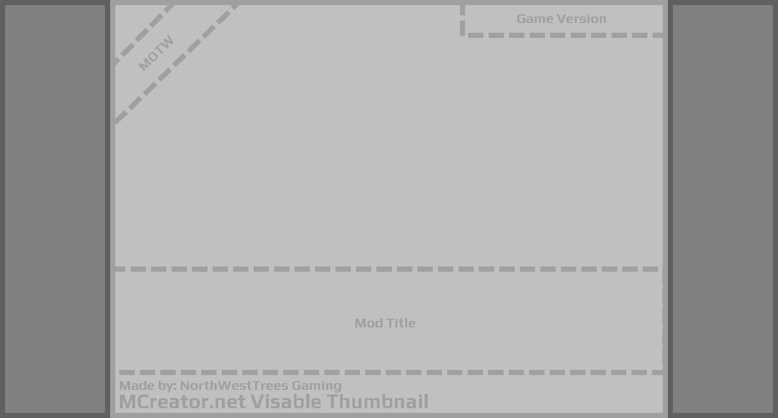
Just thought I would share this template I quickly made for MCreator mod logos and thumbnails. Dark gray sections are areas that are parts that won't be seen on the thumbnail for your mod eg: the mod community list. Light gray will be seen on both the thumbnail and mod community page.
Useful tips:
- Design your logo around the center gray box so that it is seen on both your mod page and the community mod thumbnail.
- Decorate the dark gray area with things you don't want to be seen in the thumbnail but only on your mod page.
- At the top right corner there will be a mod version number so keep this in mind when you're making your thumbnails.
I have dotted around the area to make it easier to work with. - At the top left corner if your mod gets Mod Of The Week (MOTW) there will be a ribbon located there.
- The mod title area is roughly the space where titles will be located in the thumbnail.
Text will expand from the bottom up so if your mod name takes up two lines it will take the space of the full box in the image.

I am not sure if it's possible to download the image from above so I will provide the GitHub file below just in case people have trouble getting the image from the forums.
GitHub
https://github.com/northwesttrees-gaming/.github/blob/main/mcreator_mod_thumbnail_template.png
Edited by NorthWestTrees on Wed, 03/08/2023 - 17:04