Started by
Sir_cookie98
on
Topic category: Website and community discussion
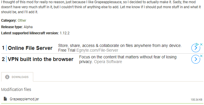
I personally don't like the new formatting on mod pages:

I feel like the download and changelog pages are easier to access at the top, especially on mod pages with very large descriptions.
Why was it changed?
Edited by Sir_cookie98 on Fri, 06/05/2020 - 15:25
Many users were not able to find the downloads as they were hidden in the tabs. Many users prefer to read the description before downloading the mod too. We will do some testing and analytics to see how this will perform, but based on current analytical data, this should be more user-friendly.
I just got an idea. I will add a jump to downloads link to the top of the mod page that will scroll to the bottom to join the best from both worlds.
I think it would be the best option
I have added the jump to downloads link to modification pages.
I still like the old formatting because the new one is weird
I have been away for a week, didn't see all of these comments
It sounds like it's sorted out now, thanks Klemen! :D
You are welcome!
Welcome Back Boi!
Thanks! :D
Hey SirCookie, Do you have a Good Mod Name? (It add these Bees,and other Cave/Nether/Overworld/End Stuff what minecraft needs.
https://www.minecraft.net/de-de/article/minecraft-snapshot-19w34a
It's pretty difficult to think of names for things that don't have a main theme... I'll try to think of one :)
Incidentally, what do you think of Minecraft 1.15 adding bees?
I Like them,maybe a bit smaller. But i LOVE the Honeycumb texture and honey bottle texture. The Main Theme is For My Mod,
idk xD Maybe "Exploration Theme"
Yeah, they look cool :)